Oh hello! Thanks so much for coming over and hanging out with me today. I'll offer you some cake and coffee (or tea and scones?) while you make yourself comfortable. You could be here awhile today.
Catrice seems to be a much coveted brand on YouTube and I think it's largely due to the fact it's unavailable to purchase in non-European countries, which instantly makes it attractive and throw some beautiful packaging into the mix and you've got yourself a cult following without even trying.
I am very fortunate in that I have friends in Europe - even more fortunate that they were willing (and very happy) to send me some.
 |
| [ starter family ] |
My first love of Catrice came in the form of a nail polish. That's not surprising in the least since I adore nail polish to begin with, and aside from that, I'm a
girl. Girls dig nail polish. And this girl is open to pretty much any colour under the sun.
 |
| [ L-R: Big City Life (L/E) & Genius in the Bottle ] |
"Big City Life" is a fabulous brushed gold. It's almost a green-based gold, if that makes any sense. There is not much yellow in it whatsoever, but that's completely okay with me. I love brushed gold just as much as I love a bright, sparkly, in-your-face glitter.
"Genius in the Bottle" is my absolute, hands-down favourite Catrice polish to date. So far no other colour has beaten it - not even come close really. It's a dupe for Chanel's "Peridot" and OPI's "Just Spotted the Lizard" which just makes it so much more appealing, especially since OPI retails in Australia for $19.95 (RRP) and Chanel $39 (RRP). It's a multi-chrome colour in my opinion; the colour changes and shimmers depending on the light. I absolutely
love it.
 |
| [ L-R: UpperWILDside (L/E) & Marilyn and Me ] |
"UpperWILDside" is a fabulous burnt orange with a suede finish. There is nothing about this colour that puts me off, and if Australia had transitional seasons, this would definitely be a colour I would favour. It looks absolutely divine against tanned skin, and equally elegant against paler tones.
"Marilyn and Me" is an unbelievable red with some tiny sparkles thrown in for good measure. It glimmers just right under the lights and isn't overpowering. When you're not in the mood for full blown glitter but you still want something a little sparkly and pretty for your nails, this is the colour to pick. It's a blue based red and (I think) is the perfect Christmas colour.
 |
| [ Dirty Berry ] |
If you're a fan of cool purple tones, this is a colour for you. Very much like the above "Marilyn and Me" this polish has tiny sparkles for that extra something. It looks gorgeous on, and like with all Catrice polishes, it glides on like a dream. It's completely opaque in just two coats though it does take a little bit to dry if you don't have a helper like Seche Vite or Sally Hansen's Quick Dry.
Final summary on Catrice polish: Five stars. Also, I need more.
I have quite a few eyeshadows in this brand, and while I do enjoy them quite a lot, they are very hit and miss with me. I have medium skin tone so unfortunately, unless a shadow is highly pigmented, it doesn't show up very well. This is the case with many of my Catrice shadows. I find that I need to pack them on to get even a little bit of colour to show through, however I am going to start using them with the Maybelline Colour Tattoos to see what difference that makes before I give my final thoughts. I will say however, that right now, they are very hit and miss.
So, let's start.
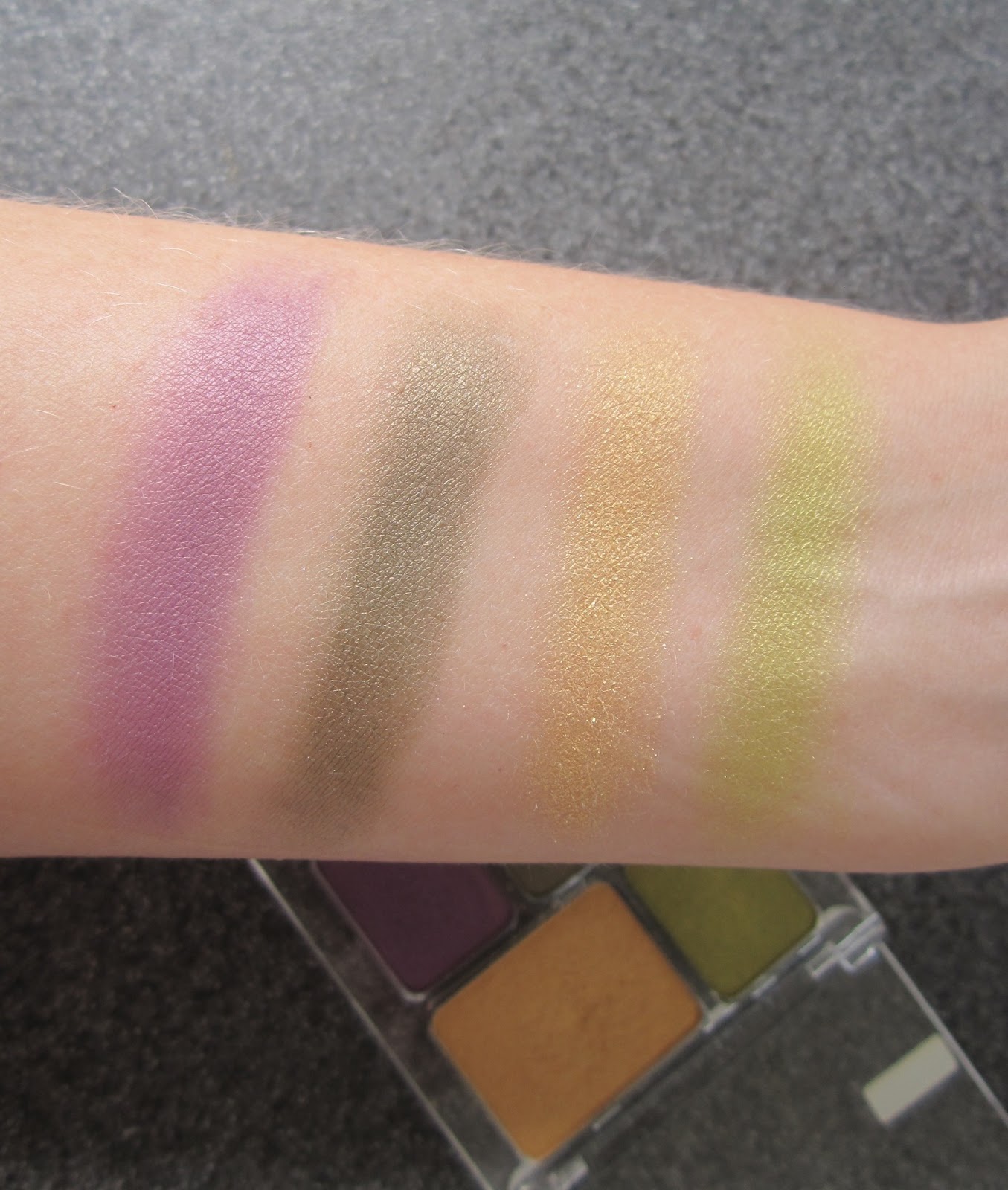
 |
| [ Rumble in the Jungle quad ] |
This is the first and only quad I own, and I
love it. The colours are pigmented and blendable and go on like a dream. None of the colours are matte, but they're not especially shimmery. I love each colour fairly equally, and I would love to get more of these.
 |
| [ purple, olive green, gold & lime green ] |
They swatch beautifully and they feel so silky soft. These colours do not wear quickly at all, so if you need them to stay for at least six hours, they will - I use the ELF eyelid primer underneath. This quad is a winner.
Unfortunately, this next palette is a miss for me:
 |
| [ The Shanghai Collection - Big City Life ] |
Is the box not gorgeous though? I was so surprised and
giddy to see this in my swap box with my amazing and beautiful friend Ute (from Germany). With all the success I'd had with the Jungle quad, I was sure this would be another winner.
 |
| [ I shall lure you in with my pretty packaging ] |
Look at it! It's divine! The colours look unbeatable, don't they? Those blushes -- so heavenly? And for you fans of chocolate brown, feast your eyes!! I was suitably impressed and oh so excited to get stuck into this. Behold! The blush swatches:
 |
| [ L-R: Pudong & Bund ] |
The top picture was taken in sunlight, the bottom was taken inside. My heart sank. These are not at all pigmented and I had to really pack on the swatches to get them to show up on the inside of my forearm. Since I have not yet applied them to my cheeks, I will reserve my final thoughts until later. Onto the eyeshadow...
 |
| [ L-R: Transrapid, Nanjing Road & Yu Garden ] |
Swatching these on my forearm, top picture taken in sunlight, bottom taken inside. Again, I had to really pack them on to notice any colour at all and the center colour (Nanjing Road) barely shows up. On my lids it is not noticeable at all, not even as a transition colour. And, the more I try and build it up on my lids, the muddier it gets.
Onto the second row of shadows in the collection:
 |
| [ T-B: Cloud 9 Bar, Jin Mao Tower, Oriental Pearl Tower ] |
The picture on the left was taken in sunlight, the one on the right was taken inside. While these give the appearance of being more pigmented, they are not. The middle colour "Jin Mao Tower" barely shows up, and I had to build that one up more than the other two colours. While I absolutely love the golden yellow "Oriental Pearl Tower", it does not work as a brow highlight or inner corner colour on my skin tone which just makes me so sad.
I think this box is much more suited to paler skinned gals rather than the medium skinned gals such as myself and I found myself wishing quite hard that I would be pale enough in the winter months to wear it. I am still holding onto the hope that I will be. I am going to try layering this over some the Maybelline tattoos I have to see if it makes a difference. I have my fingers crossed that it will.
Moving onto the only Catrice blush in my collection:
 |
| [ Nymphelia Blush "UnbeLEAFable" L/E ] |
I was given this blush by two absolutely wonderful girls on YouTube -
you may know them as Brigitte and Cornelia of babycake390 - and when I saw this I was instantly in love with it. How could I not be? Look at this! It's gorgeous!! Just by looking at it, I can tell it's a beautiful warm apricot colour, most likely with a golden undertone.
 |
| [ It's fun to be right ] |
When I swatched it, I'm pretty sure my heart was all a-flutter. (Yes, blush does that to me -- what of it?) In my mind's eye I saw my cheeks with a gorgeous golden apricot flush. In reality... not quite so much. It swatches well on the inside of my arm, but not well on the back of my hand. That was my first clue. Then I grabbed my trusty ECOTools blush brush and applied it to my cheeks. Ho hum. Big sigh. Sad panda face. Like with the palette above, I have to layer this blush quite a bit to get it to show up.
Note to self: Stop trying these things in the middle of summer. Wait until you're pale and tragic and in the middle of winter.
Onto the single eyeshadows:
 |
| [ Starlight Expresso ] |
The top swatch was taken in sunlight, the bottom was taken inside. This is a perfect matte grey which is absolutely perfect for facial contouring. I have never used this as an eyeshadow but given how pigmented it is, I can only imagine what a gorgeous shadow it would be.
 |
| [ Oh it's Toffeeful! ] |
The top swatch was taken in sunlight, the bottom was taken inside. This is a lovely shimmering neutral gold. It's not nearly as bright or shimmery as Half Baked (Urban Decay) which is why I say it is more of a neutral gold. The shimmer is barely noticeable, and I feel it could just as easily be worn by those with mature eyelids as those with young eyelids. I don't consider this to be very buildable; it just gets to a certain point and no more colour can be achieved. I've used this with the ELF eyelid primer though I would recommend using it over a Maybelline colour tattoo.
 |
| [ My First Copperware Party ] |
The top swatch was taken in sunlight, the bottom was taken inside. This is a very pretty brown/copper colour that certainly looks lovely by itself as an all over lid colour, or with a dark colour in the outer vee. For me this doesn't work as a crease colour as it tends to turn a little muddy but I have used it as an outer third colour as well. It definitely makes for a subtle yet pretty day look.
 |
| [ Ooops, Nude Did it Again ] |
The top swatch was taken in sunlight, the bottom was taken inside. With only a very, very slight sheen to it, I thought this colour would be absolutely perfect as a brow highlight or an inner corner highlight. On me, the sheen is almost non existant so instead it ends up looking more along the lines of Brulee -- which is still fine for most days. The sheen is enough that I can't use it in my inner corner because it's a little bit crepe-y and therefore tends to make it standout. Not what I'm aiming for. Otherwise, a very pretty colour and would probably suit someone with a lighter skin tone.
 |
| [ Dorian's Grey ] |
The top swatch was taken in sunlight, the bottom was taken inside. This is one of my newest shades and I love it! I haven't yet used it but I am making it my mission this year to use grey on my eyelids. I hope it will look as pretty as I think it will. Like the others, this has a light sheen finish and may not be suitable for the inner third on mature eyelids.
 |
| [ And the Oscar Goes To ] |
I
love Catrice lipsticks! They're rich and creamy and beautifully pigmented: all the things a wonderful lipstick should be. They're not especially long lasting -- a few hours at best, without eating or drinking. When the colour fades, you are left with some slight colour; certainly enough to wipe a gloss or balm over and not fuss about having naked lips.
Final summary on Catrice lipstick: Four stars. Also, I need more.
Have you tried Catrice? I'd love to know what your hits and misses are, particularly since I am looking to add more to my collection!
Thanks so much for hanging out with me today!
x


the one Catrice shadow i used was shimmery and didn't have a lot of color pay off... but i love them so much that i'm going to try them on top of a color tattoo as well... and that lipstick is to die for!
ReplyDelete